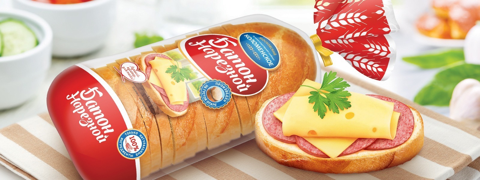


BREAD KOLOMENSKOE
When designing the packaging for bread, it is necessary to take into account that, however original the design may be, in reality it will lie in a deformed package, not necessarily facing the customer, and sometimes mixed with competitors’ products. In this case, bright and catchy design elements are important, which will instantly identify the brand, even if only a piece of packaging is visible on the shelf. Often, such a piece is the tail of the package, so it was decided to seal it with a branded wheat pattern, which also solves the problem of color differentiation. The writing of the names is made in the same style based on one of the modern fonts. Also we put the food zone on the package, which is not a trend in the category of basic bread lines, so you can use it as one of the distinctive features.
- It unites all products of the line with one design concept.
- It increases brand awareness
- It shows the consumer the qualitative changes in the product through icons.


Our clients


