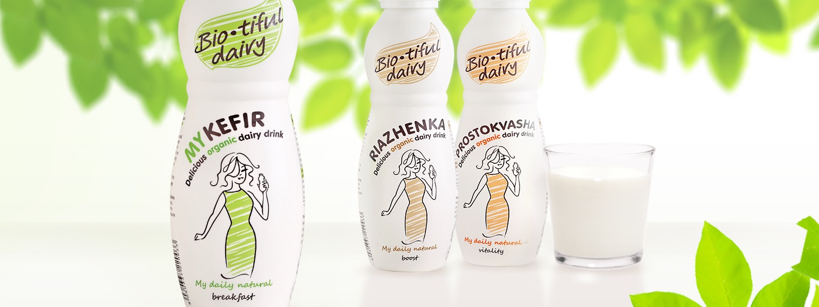


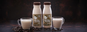
BIO-TIFUL DAIRY
The graphic design for Bio-tiful milk drinks was developed by Quantum Graphics branding agency in collaboration with the founder of the company Bio-tiful Natasha Bowes.
The promise of a healthy lifestyle and great taste of the drink became the main goal in package design. Quantum Graphics analyzed the idea and developed several potent concept solutions on the spot. Continuing to develop them, the agency managed to create a full-fledged and elegant image of a new brand. Thus, the task to combine the minimalism of delicate color combinations, vivid character and “live” text in the stylistics was very effectively achieved.
The sophisticated feminine character is blended with the shape of the bottle and underlines the benefits of the probiotics contained within, their light and pleasant taste. The logo elegantly combines the shape of a leaf and a drop of milk, reinforcing the emphasis on the brand name. And the natural style of graphic elements reflects the organic basis of production.
Competent and convenient location of all the necessary consumer information on the perimeter of the label complements the main idea of the brand about “smart” food, provided by their products. Bio-tiful Dairy – nutritious, tender and very tasty!
Our clients


