


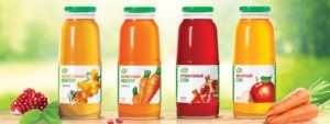


NATURAL JUICES AND NECTARS
A5
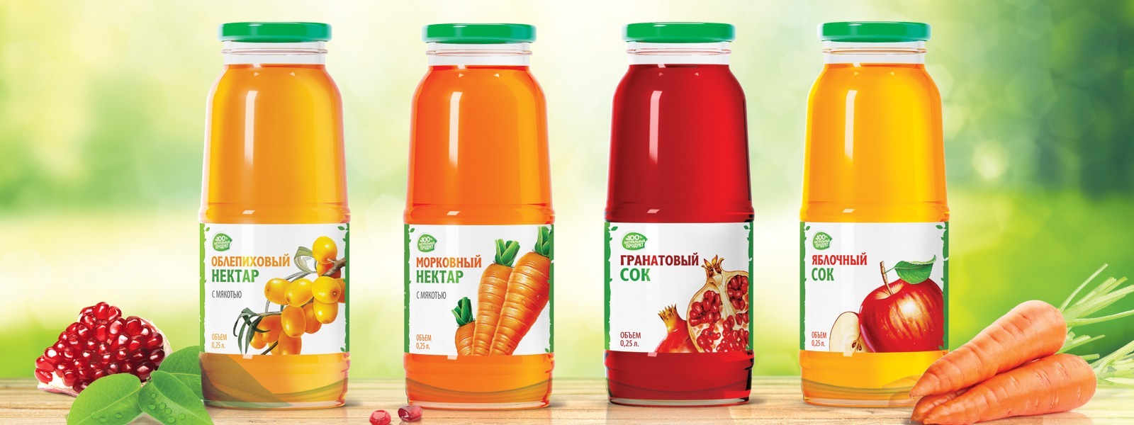
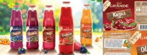
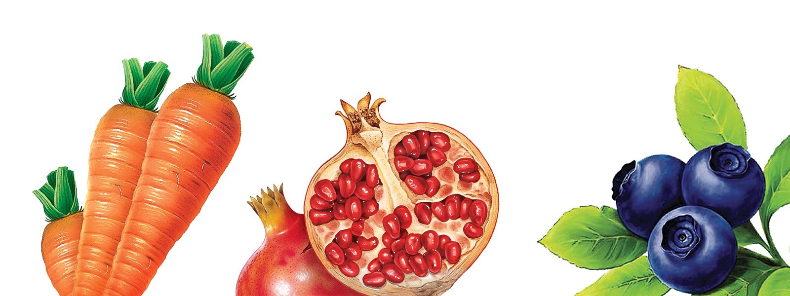
We wanted the design to symbolize the naturalness and freshness, so the whole line is based on white and green colors. The color coding is carried out by the juices and nectars themselves – this is facilitated by a clear bottle. The color of the taste on the label also supports the coding. The main element of differentiation is the taste identifier. To highlight the bottles on the shelf, we decided to move a little bit from the traditional grocery zone. Namely, to discard photos in favor of illustrations. Color graphics techniques make vegetables, fruits and berries no less appetizing than photos. The result was a bright, tasty, fresh and, in part, rural design, that preserved the overall impression of the pharmacy product.
Our clients


