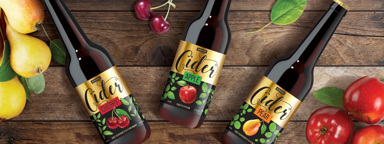


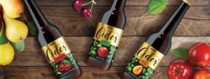


CIDER GENEVIEVE
X5 Retail Group
When developing the design, it was taken into account that the cider on the shelf will be surrounded by beer, moreover, in a bottle that is very similar to a beer bottle. Therefore, the main task was to highlight a product, not a brand. As a result, the main and largest element was the word “Cider” on a gold background, and the brand name (“Genevieve”) faded into the background and is only a part of the logo. Such a bright design will not let the bottle get lost among the competitive environment, and the customer will instantly determine that there is a cider in front of him, and not a fruit beer.

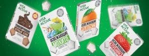
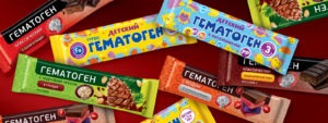
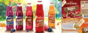
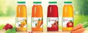
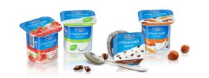
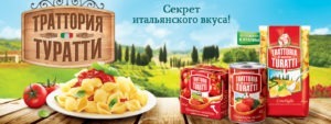
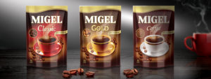
Our clients


