


A-MEGA PHARMACY
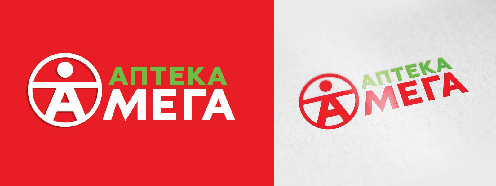
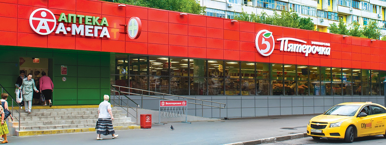
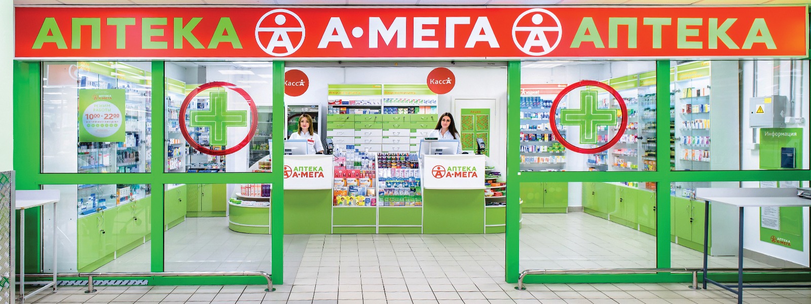
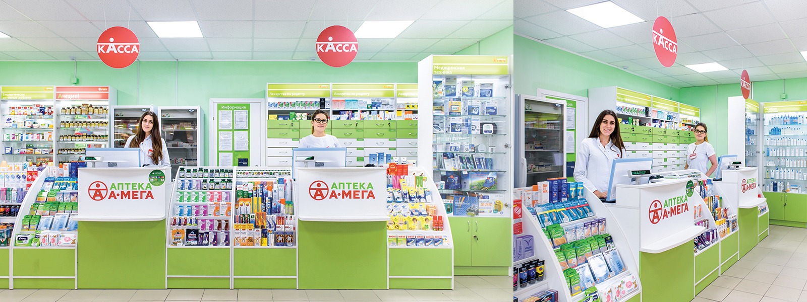
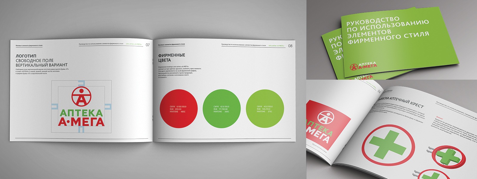
Quantum Graphics branding agency has developed a logo and corporate style constants for the A-Mega network of pharmacies. The logo reminds of Leonardo da Vinci’s Vitruvian man, demonstrating the canonical proportions of a perfect body. This sign was also used in the design of retail space and visual communications. As a result, we have developed a complex of layouts for the design of facades and trade equipment, layouts of visual communications and corporate media of corporate identity, as well as a brand book describing the rules and standards for outlets for effective retail network scaling. SIA International positions the A-Mega brand as a discounter. The retail units are located mainly in the checkout area of X5 chain stores (Perekrestok, Pyaterochka, and Karusel), as well as in the trading halls of Pyaterochka supermarkets (shop-in-shop format).


Our clients


