
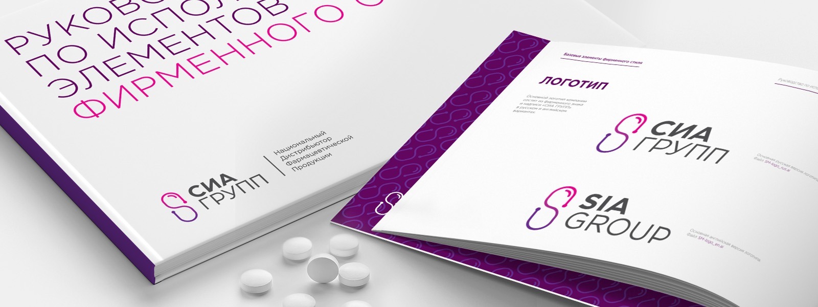
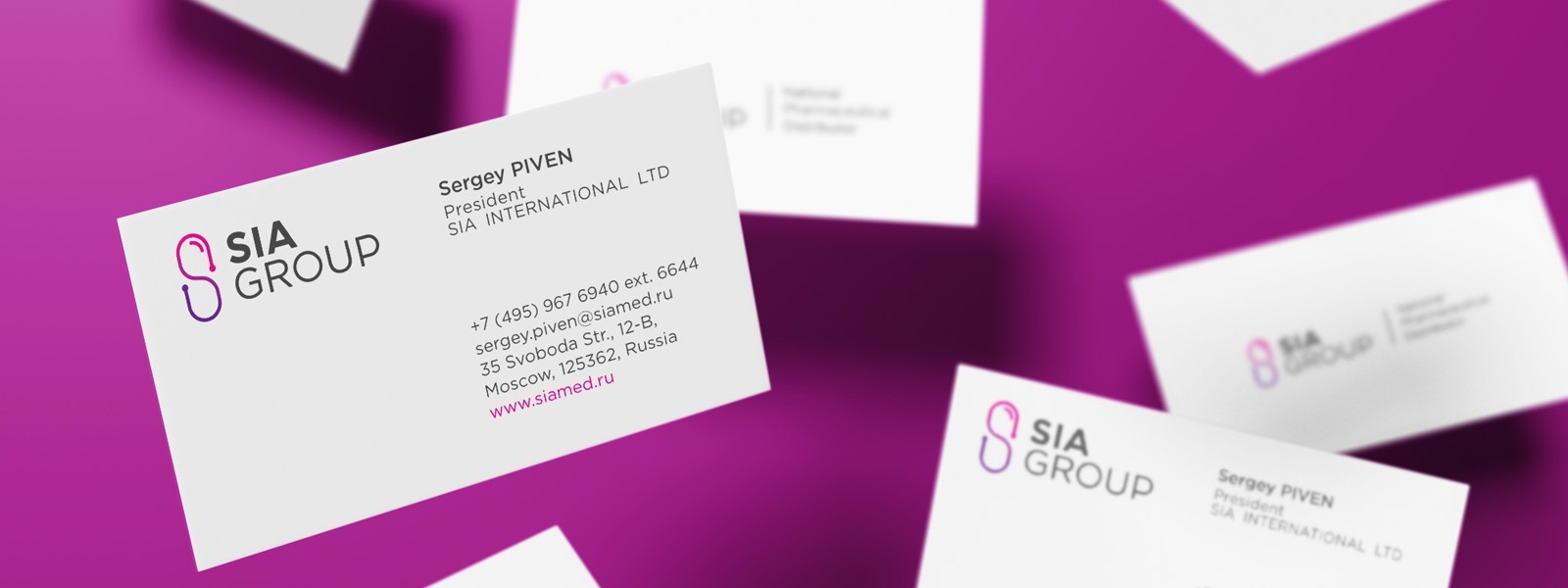
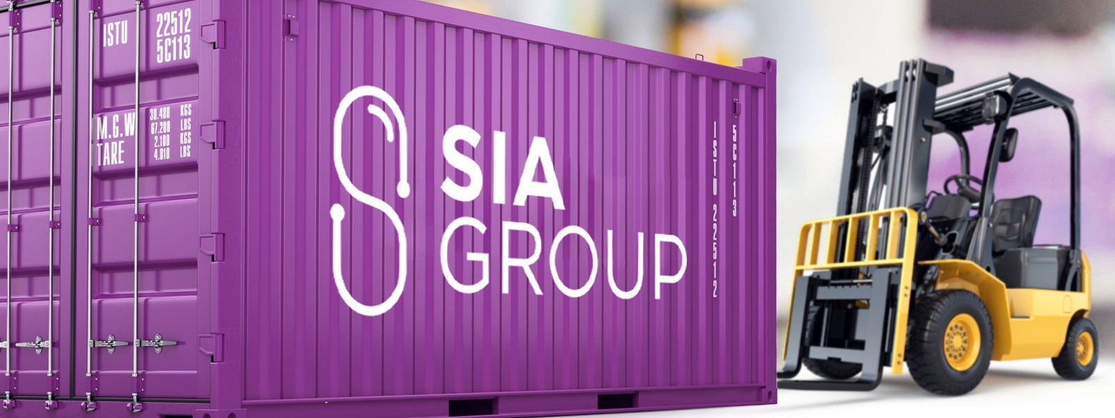
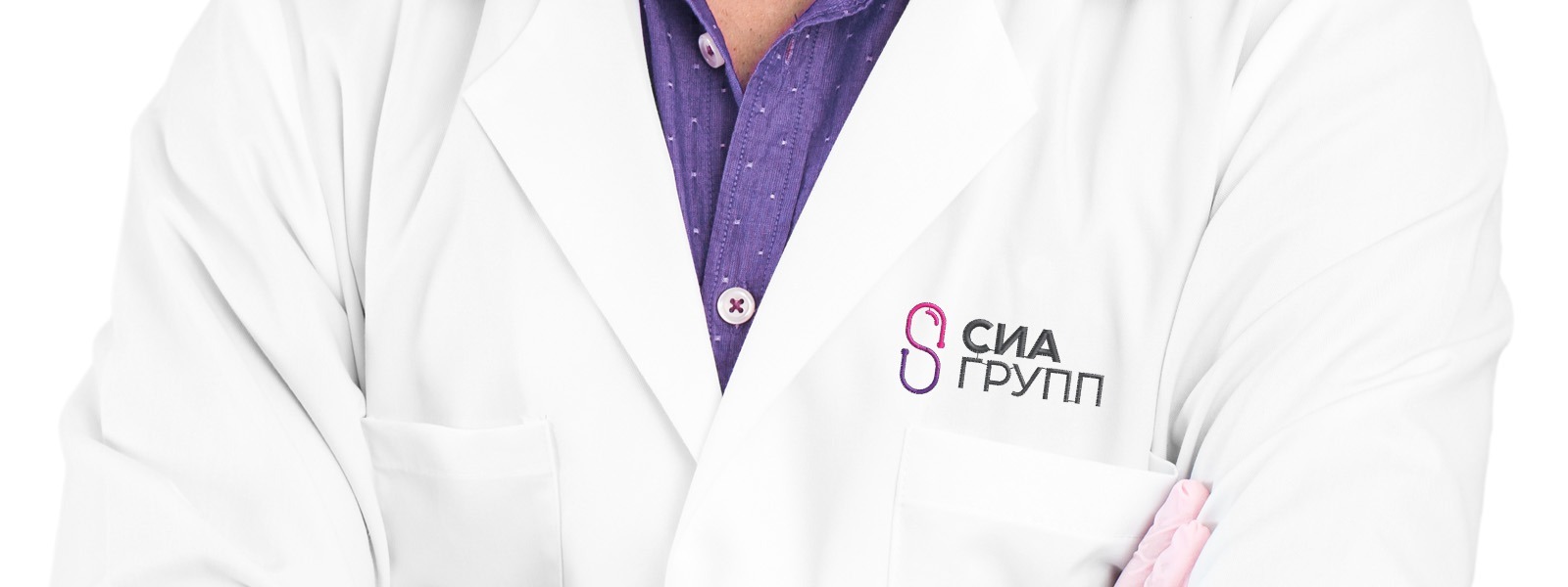
REBRANDING OF SIA GROUP
SIA GROUP is one of the largest Russian pharmaceutical distributors with over 20 years of experience. In 2016, there were many changes in the company: new shareholders and top management, new investments, new goals and targets. In this regard, there was a need to form a new, more modern image of the company, symbolizing its rebirth.
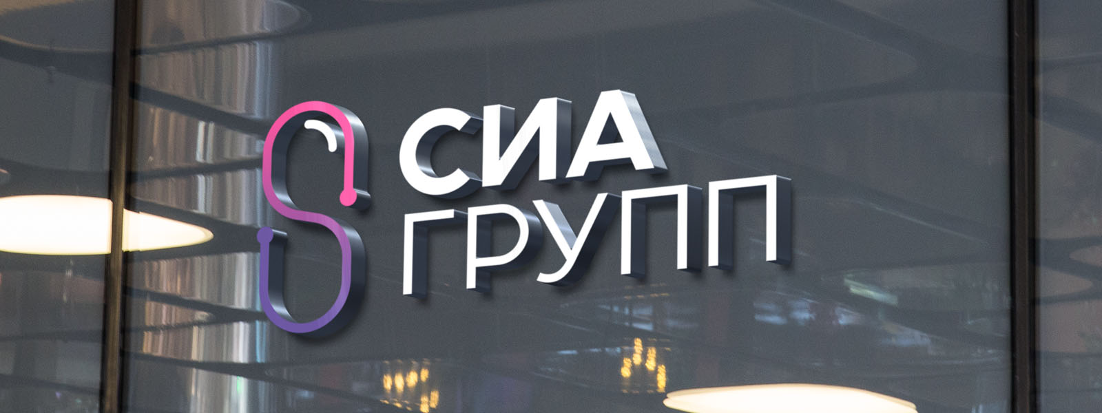
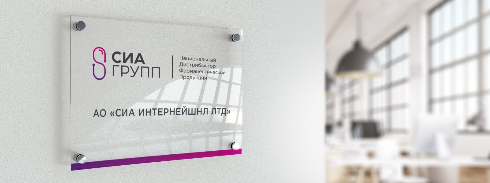
The new logo combines the following attributes of brand identity:
— Imitation of the path from point A to point B symbolizes fast and accurate delivery of medicines to all settlements of the country. It reflects competences in logistics and the skills for work with clients.
— The capsule shape reflects the scope of the company’s activities, its focus on maintaining public health. Additional insight – the capsule, as the main product of SIA GROUP. The contents of the capsule is a balanced complex of professional business solutions aimed at “improving” and strengthening the business of the company’s partners. Bottom line: cooperation with SIA GROUP is reliable, comfortable and mutually beneficial.
— We used the shape of infinity sign. It symbolizes the thirst for perfectionism and the endless desire for the development of the company: more distribution coverage, wider range, more streamlined logistics, and so on.
— The sign has the shape of the Latin letter “S”, the first letter in the name of the company. This strengthens the relationship of all other attributes of the brand identity and contributes to the recognition of the name of the company.
The color design of the corporate identity is determined by the criteria of manufacturability, modernity and the desire to distinguish the company from competitors.


Our clients


