
Ice cream ICE NET and JUST GUSTO
Ice cream ICE NET and JUST GUSTO, or the new social network of friendship.
Quantum Graphics has come up with a way of introducing older persons to other people.
To make them feel in the thick of life and communication. To take a fresh look at those who have a vast life experience and are ready for something new.
In 2019, EPDA teamed up with the major ice cream maker Hennig Olsen to organize a contest for the best brand idea of the ice cream for elderly people.
Humanity is aging. Life expectancy in Europe is increasing and the general health of the elderly is getting better. Urban residents in the age category 65+ live an active lifestyle and have a wide range of interests. And this target audience is growing rapidly. It is estimated that by 2040 there will be two working residents for one person over 67.Citizens from this target audience have a good income, live alone or with their partners. Their health just isn’t what it used to be, but they don’t like to talk about it. They enjoy spending time with the family and loved ones and are ready to share great life experience. They are not very interested in environmental issues, but do not mind making the right choice, as long as the ease of use is preserved.
The task is to develop an innovative ice cream product and a packaging concept targeted at consumers aged 65 and over. Any type of packaging, its format, size or material is possible, as well as a consumption situation (at home or outside). New packaging materials, shapes and green choices are welcome. It is necessary to make the product so handy that the consumer can enjoy it. The main salespoint is a grocery store.
Quantum Graphics agency has proposed the idea of creating a sweet social network where everyone can find a friendor a loved one. Where it doesn’t matter where you are, how old you are and what kind of ice cream you like. Just choose the ad you like and try a new taste.
The information space has become unified, and this trend will continue. People feel affinity for and understanding of people of their own and other generations. Common films, common interests, common trends. The only difference is the number of live contacts and the reasons for them. With age, people communicate less, they focus on themselves and their problems. They are less likely to learn new things, they change jobs less often, and all this naturally reduces the number of new acquaintances. Therefore, we think it is wonderful that people will meet and communicate again,happily expecting news, guests and new meetings.
And there is a reason for this: interesting combinations of flavors of the new ice cream brand. We invite elderly people to look for new acquaintances through an offline social network, where each ice cream packaging is an ad about finding friends.
Version 1.
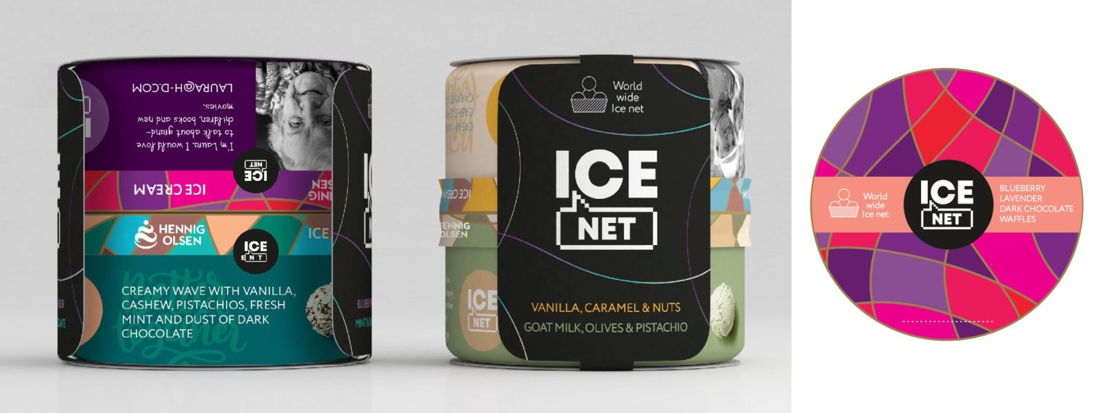
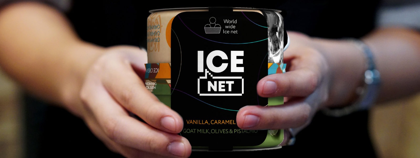
ICE NET.
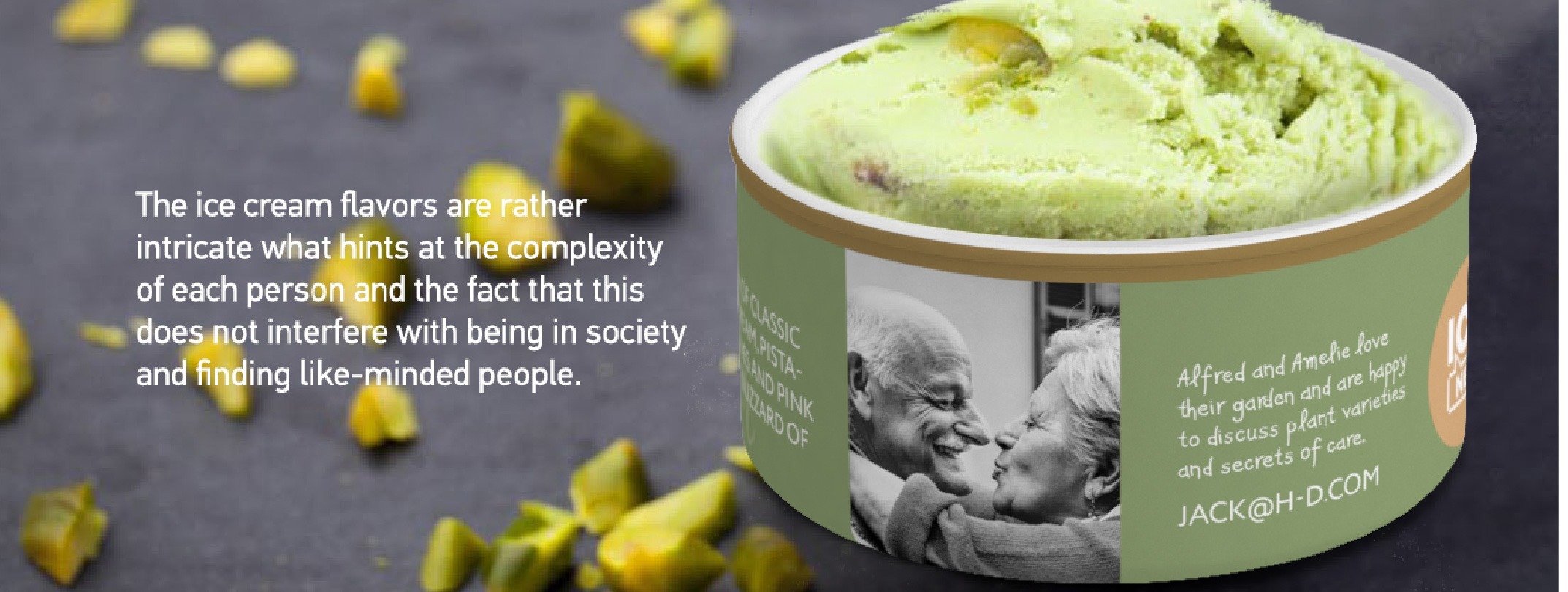
This is a story about dynamic design, where the messages about searching for friends are constantly updated. And while buying an ice cream, the customer also chooses a post about someone who is also in search. Your potential partner may live nearby, or on another continent. Only the consumer can choose whom to be friends with. The ice cream has some pretty intricate flavors, implying the complexity of each personality, which does not interfere with being in society and finding soulmates. Thus, we offer the idea of uniting and helping people who want to communicate more.
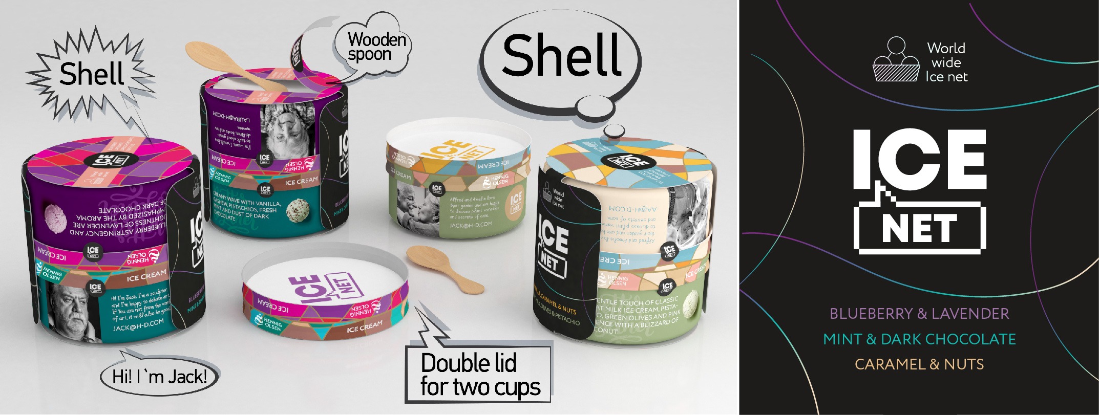
The logo and the sign are a speech bubble representing communication and pixel graphics referring to computers andto the idea of a digital world where there are no limits in time and geography. The decorative pattern on the packaging symbolizes the network, where each segment is a complete, independent shape with its own color. Yet these diverse shapes and colors are harmoniously combined in a single structure. Also, on the package you can find a photo and a short description of those who are looking for friends. And their contact email.
We propose to produce packages containing two flavors of ice cream, where two paper cups with different ice cream are closed with a single lid with a double inside. The two cups are of different color, but they are in harmony with each other. Which again reminds that you can be friends not only with someone who is absolutely like you. Thus, we hint at the joint consumption of the product and offer an occasion for a meeting. You can also support and develop this idea via online social networks, video blogging and offline activities: events, promotions, etc.
There is a wooden spoon on the back of each cup, placed under a thin paper sticker. This ice cream can be shared with a friend and not only at home. You’ve got everything you need. Two cups are united by a single paper cover with the brand, the names of the flavors and the elements of the corporate pattern printed on it.
It was also important for us to develop completely environmentally friendly packaging that would embody responsibility to new generations and a special awareness of not only the consumer, but also the manufacturer. Our option is a paper packaging with a wooden spoon inside.
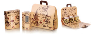
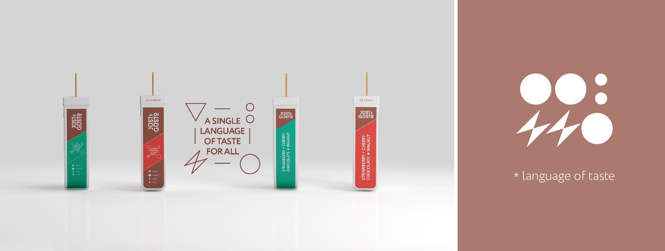
Version №2.
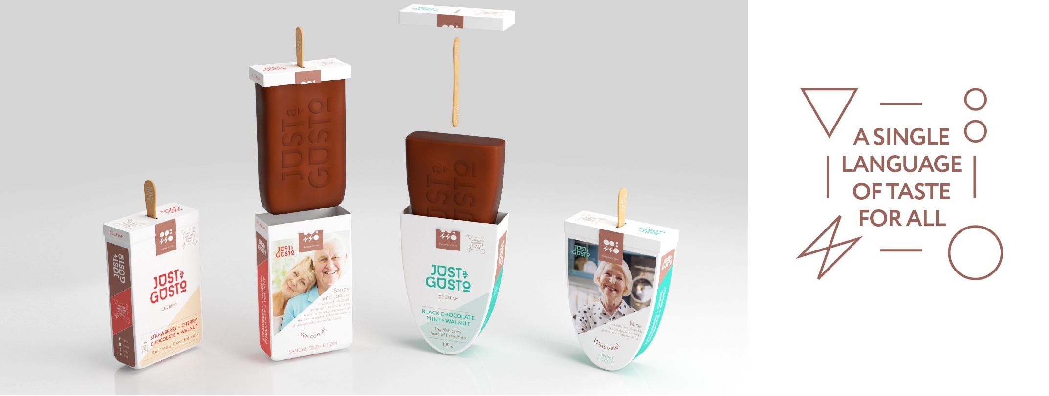
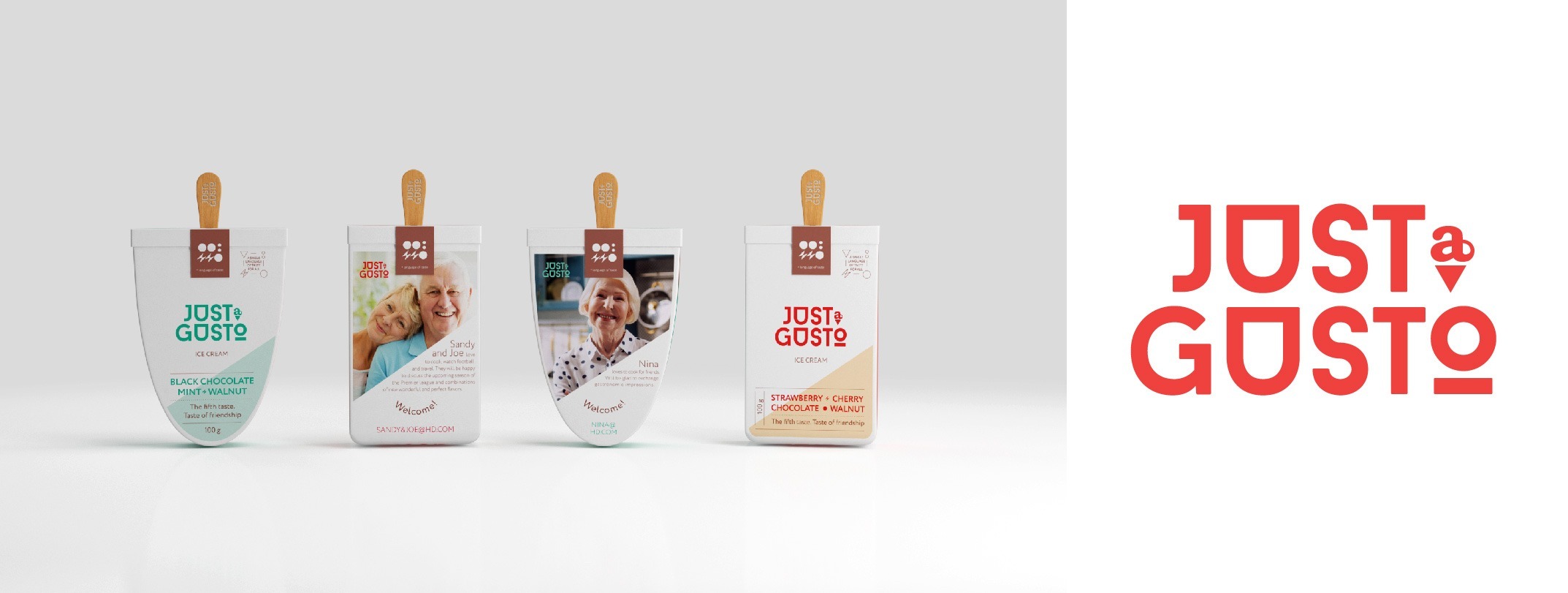
JUST A GUSTO.
Slogan: the fifth taste. The taste of friendship.
A single language of taste for all
We offer yet another idea of uniting and helping people who want to communicate more. Make the world a better place, create a world without lonely people, encourage and help them to find friends and nice new acquaintances.Create a happy world of communication for everyone.
For this we have invented a special language that all people can speak. A kind of Esperanto of taste. All over the world, people know what it is: sweet, bitter, etc. And also, all people know what friendship is. We are talking about the fact that taste is a new world language. The fifth taste is no longer “umami”, the fifth taste is a new opportunity for communication and understanding each other.
Ice cream flavors are also unusual. Each person is a whole world, diverse and complex. And the flavors of the product convey this idea as well.
Product launch and sales can be accompanied by social activities, promotions and blogging. Thus, we offer not only a product idea, but an idea of a big social trend.
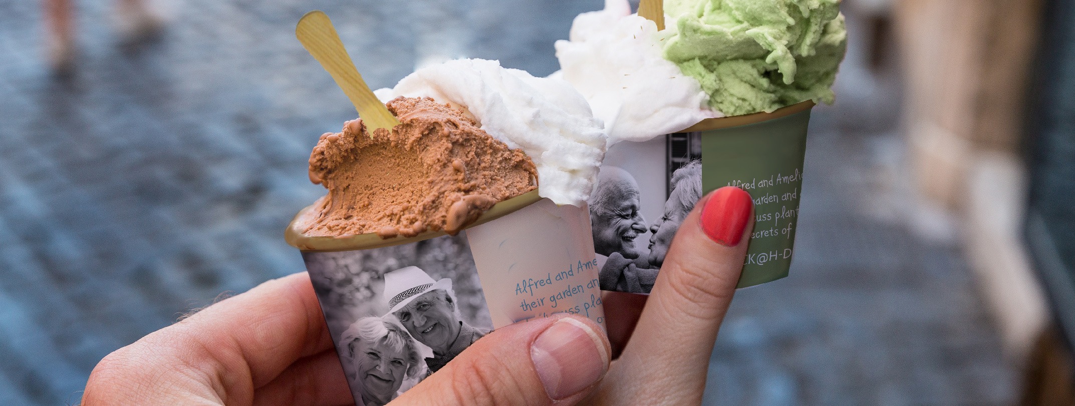
The logo and the sign are represented by a font that, from the point of view of graphics, is on the verge of transition to the state of symbols, and the preposition A resembles an ice cream cone. The corporate identity has special pictograms that reveal the essence of the idea: a new language, where words are flavors and letters are ingredients.And everyone will understand this language. Also, in the corporate graphics there is an upward-rising shape that symbolizes a world without borders and with perspectives for everyone. And you can laugh and grumble together too.There are photos on the packaging that introduce us to those elderly people who will be happy to communicate.Accompanied by a short text that tells about the main interests of these people. Sometimes it’s touching, sometimes it’s more official. But wholeheartedly and truly. There is an email address next to it. Moreover, the people from the packages can live in different countries. A world without borders!
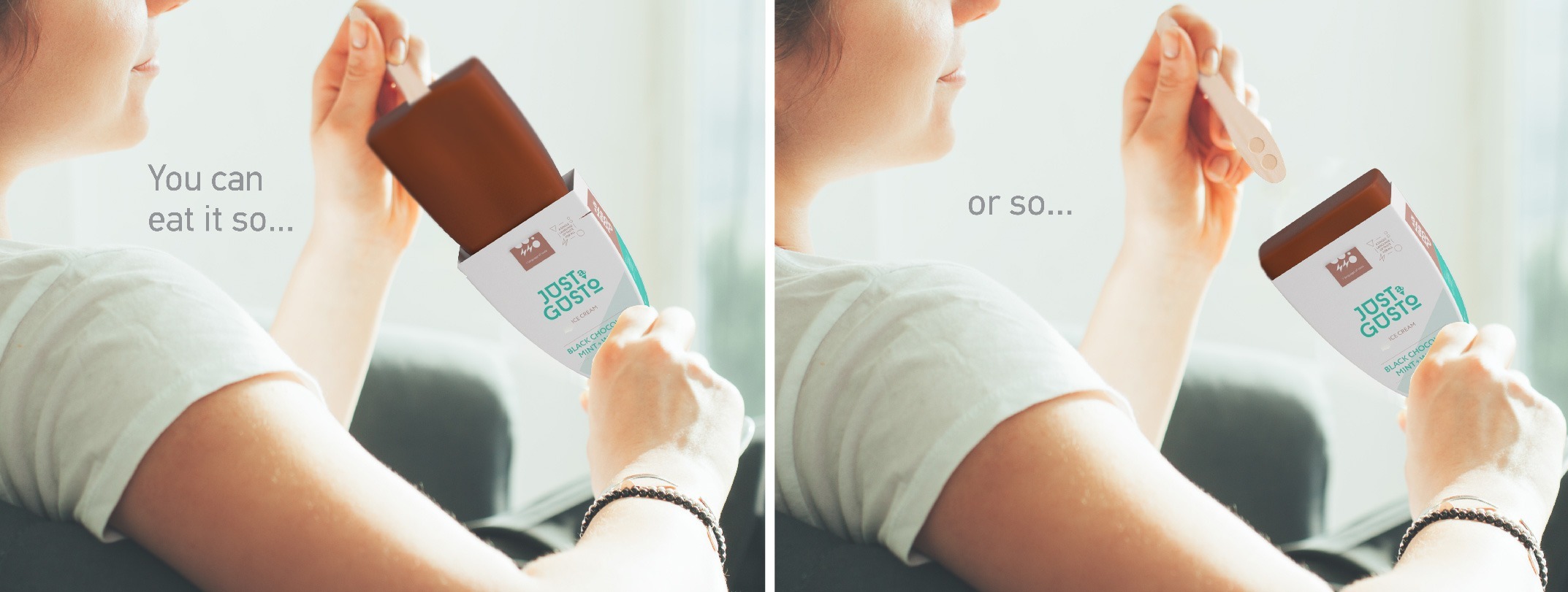
You can eat this ice cream holding it by the stick, like a popsicle. Or you can turn it over and eat it straight from the package, after pulling out a wooden stick-spoon from the ice cream. Absolute environmental friendliness: the packaging is made of paper and is presented in two forms: round and rectangular, and the spoon-stick is made of wood. With care for our descendants and the planet, with joy from taste and communication! Bon appetit!
Creative team:
Anna Afinogenova – General Director, Creative Director, Art Director


Our clients


